Playing with Proportions: Why Mat Size Matters
Proportions are an essential design element. From graphic design and furniture arrangement to fine art, how you use proportions directly impacts the final presentation and power of your art within its frame.
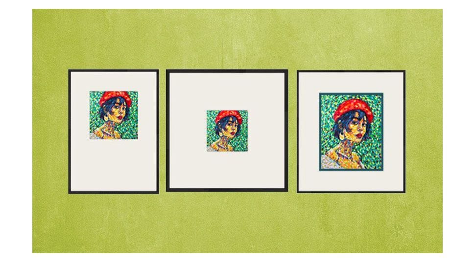
When deciding on your mat proportions, ask yourself a few questions. Is this a stand-alone piece? Is this a grouping? Are you trying to add impact to something small? Or are you trying to make something large fit into a small space? Does it look like it belongs?
Go with your gut.
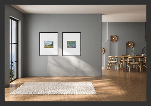
Sure—there are best practices. The most basic is to use a simple 3-inch mat to add space between the art and frame and give a safe, professional-looking finished product.
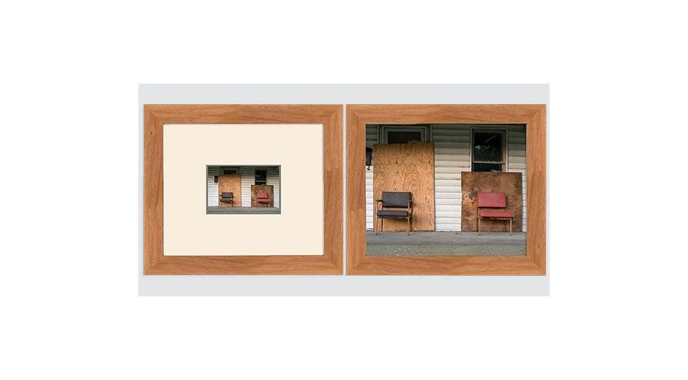
As the artist, trust your instincts. You created the art, after all. And you’ll have a feel for how you want it finished. A larger mat can change the scale of a small piece, or maybe a drop bottom (the top and sides of the mat are even, but the bottom is much larger) adds the impact you’re looking for.
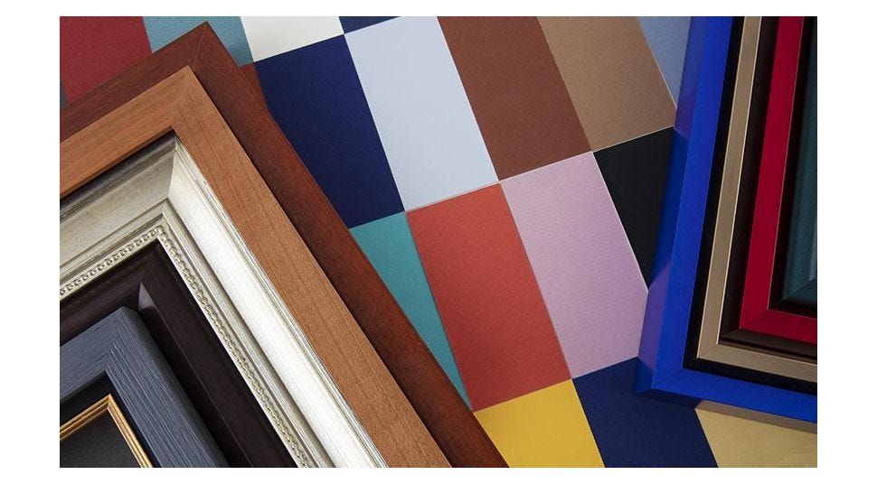
Pro Tip: You never want the mat to be the same width as the frame. When using a wider frame, the mat can be thinner, and the mat should be wider with a thin frame.

Explore Exaggerated Dimensions
If you’re unsure of what mat size you want to use, museum pieces can provide great inspiration, especially in modern photography galleries. You can also use kraft, construction, or printer paper to mock up your vision and play with mat proportions until you find the desired width.
Our step-by-step frame design engine allows you to change mat border widths easily to digitally visualize what your art will look like in relation to the frame. For face-to-face design assistance, visit our Maumee, Ohio, showroom and talk to a framing expert for guidance in picking from the highest-quality materials at the highest value.
