Professional Photo Printing in 5 Easy Steps
Create Beautiful Fine Art Prints from your Digital Photography
Introduction
In this article we will review how to prepare your digital files for fine art and professional photo printing. It is written for the more serious artist or photographer who would like to take their printed images to the next level. Here we discuss the importance of:
-
Monitor calibration
-
Using the full range of colors available to you within the color space
-
Paper selection
-
Soft proofing
-
Leveling and toning your image
For those who do not wish to edit their own images, American Frame provides various levels of retouching services to suit your needs.
1. Calibrate Your Monitor
Have you ever gone into a large retail store and noticed that all the TVs look different even though they are all playing the same movie? Computer monitors, like TVs, vary greatly in their ability to reproduce a full range of brightness and color. That’s why professional 24” monitors such as those by Eizo can cost over $2,000 while an entry level 24” monitor can be purchased for less than $200. Regardless of monitor quality, you can still ensure that it displays colors and tones accurately within its capabilities. Monitor calibration is the process used to align what is displayed on the computer monitor with an accurate representation of the colors that can be printed on paper. This process of calibrating your monitor is the single most important step you must take to ensure that the prints you create from your digital files will match your expectations.

Unless your monitor is calibrated to show colors and tonal values accurately, an image viewed on your computer is likely to look radically different from the same image viewed on your neighbor's computer. What looks light purple on your screen may really be dark blue. Printers use the actual data within the image rather than the screen appearance when reproducing color. So, even though the image may appear great on your un-calibrated monitor, the resulting print may be far different than anticipated. While it is possible to create prints that look perfect without calibrating your monitor, more trial and error is involved, and that can become costly and frustrating.
Out of the box, monitors tend to be set overly bright with a bias toward blue. This is why the most common question about prints is; “Why are my prints too dark?” Of course, if you are editing your images on a monitor that is displaying your image too bright, the resulting print will look too dark.
If you take the time to calibrate your monitor, then you can safely color correct and edit your images based on their screen appearance. This will also allow you to outsource your work to a fine art printer and receive prints that match your expectations.
Obviously, this raises the question, “How do I calibrate my monitor?” It is really quite simple. With the right monitor calibration kit, the process can be completed in less than 15 minutes. A monitor calibration kit includes software and a hardware device that measures the color and brightness that your monitor produces. Basically, you set the measurement device on your monitor and the software displays a series of color swatches on the screen which the device records. In this way, the program determines the range of colors and brightness that the monitor is capable of reproducing. Most kits will set the color and brightness to commonly used values. Once your monitor is calibrated, you can edit your images with confidence!
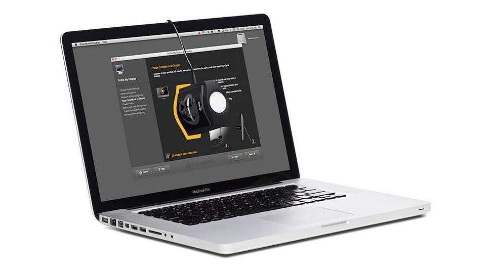
To better understand the choices available on the market, we recently conducted a thorough user review of several monitor calibration packages. After working extensively with the Datacolor Spyder4 Express, the Datacolor Spyder4 Elite, the X-Rite I1 Display Pro, and the X-Rite ColorMunki Display, we heartily recommend the X-Rite ColorMunki Display.
The X-Rite ColorMunki Display offers the best combination of simplicity and power. The fun name speaks to the light hearted nature of the package. We found it to be well refined and the easiest to use. The software guides you through each step of the process, includes a helpful video tutorial and gives great results from start to finish. The X-Rite ColorMunki Display retails for $199, but can be found for around $175.
For more information read our monitor calibration software review.
2. Use All of Your Colors
Use the full range of colors that your camera can capture. By default, most cameras don’t capture the full range of colors that they are capable of recording. So, when you are out photographing intensely red roses in the warm morning light, your camera is likely recording the red of the rose as less saturated than it really is.
Why would this be? Most cameras were originally set to record colors into a specific range of color, a color space, called sRGB. This color space was designed to approximate the average range of a computer monitor. The thinking was, why capture a range of colors greater than what your monitor can display? Since then, monitors have improved a great deal. Now there are many monitors that display a range of color much larger than sRGB and closer to limits of the larger Adobe RGB color space. Below, is a 3D comparison of the two.

As you can see, when we lay these 2 on top each other, the wireframe of the AdobeRGB1998 color space exceeds that of the sRGB color space. Thus we can clearly see that AdobeRGB1998 has a much larger color space than sRGB. All DSLRS, digital single lens reflex cameras, have the ability to set the color space that is used by default. Many higher end compact cameras do as well. Be sure to set your camera to use Adobe RGB if it is an option.
Similarly, don’t convert your images to a smaller color space when editing. Many print providers ask you to convert your images to sRGB before uploading them for printing. Please don’t take that step. Essentially, that is like drawing with a box of 12 crayons when you could have used 24. We utilize all the color in your image when printing by converting directly to the color space of the printer/paper combination that you selected. This allows us to get the most from your images.
3. Select the Right Paper for Your Image
It is surprising how different an image can look when printed on an assortment of papers or canvas. People often try to save money by selecting a less expensive paper unaware of the impact of the choice. In reality, the type and quality of the paper that you select makes a significant difference in the quality and feel of your reproductions.
The ‘right’ paper is a matter of personal taste and is dictated by price, quality and aesthetics. If there was a single ‘best’ paper, then we wouldn’t offer any choices!
To illustrate, we’ve provided a 3D comparison of the range of colors that can be produced using Epson Premium Luster Photo Paper vs. Epson DoubleWeight Matte Paper.

Both are high quality papers, yet clearly the Premium Luster Photo Paper can produce a much broader color gamut. Glossy or luster papers are best for achieving the greatest range of colors. However, not everyone likes the shine that is common to glossy papers. Luster papers are particularly popular as they closely approximate the type of paper commonly used by photo labs for decades. They have a gloss to the surface, but they have a slight texture which doesn’t make them as shiny. They both have a resin, plastic, surface which may be unappealing to some.
Matte papers don’t have that resin coating, so they don’t appear as shiny nor do they have a ‘plastic’ look about them. Some people feel that matte papers resemble high quality standard printer paper.
On the other end of the spectrum are high quality fine art papers such as Hahnemuhle Photo Rag, or the Epson Hot Press Bright. The papers are soft to the touch; almost velvety and tend to be very thick. If you have a fine art background in drawing or painting, then you will likely appreciate the tactile quality of these papers. Many people remark that prints on fine art paper don’t look like inkjet prints. They associate the look more with traditional printmaking and painting processes.
Canvas is also a popular choice. Of course, canvas is most closely associated with painting. Canvas is a particularly popular choice when printing portraits or reproductions of paintings. A stretched canvas has a look all to itself. The undulating surface of the canvas creates somewhat of a softer, more muted look. If the minute detail in your image is critical to your vision, then canvas may not be the best choice.
Also consider the color of the paper. Yes, they are all more or less white, but white differs a fair amount among inkjet papers. Hahnemuhle Photo Rag looks warm when compared to the brilliant white of Premium Luster Photo Paper. This is not a disadvantage of the Photo Rag paper, rather it is a unique characteristic that needs to be weighed. Many people like the warmth and feel of the paper when printing black and white photos. The choice is a matter of taste.
4. Soft Proof or Preview How the Image Will Translate
Given that your image will look considerably different depending on the paper and printer that are utilized, it can be a challenge to predict exactly how your final print will look. When printing, the colors that are in your image are mapped to the colors that the printer/paper combination can reproduce. This can result in some colors appearing different than expected. In order to see how the image will look when printed, you can perform what is known as a soft proof.
Below, is a 3D comparison of the colors that are contained in an image in Adobe RGB color space and the colors that our printers can produce when printing to Epson Premium Luster paper.

Notice that there are many areas where they don’t line up with one another. This is largely due to the fact that the image is formed from light whereas the print is formed from ink. They are simply different animals.
A soft proof is achieved by temporarily restricting the colors of your monitor to the smaller range of color that your printer/paper combination is capable of reproducing. The last several versions of Adobe Photoshop and Adobe Photoshop Elements (and beginning with Lightroom 4) support the feature.
Of course, your monitor has to be calibrated in order to do this which is why this article begins with that process. You also need to download and utilize the appropriate files which describe the range of colors that a particular printer/profile is capable of producing.
Read our soft proofing tutorial for more information on the process and our ICC Profiles page to download the profiles for the specific papers and printers used at American Frame.
5. Make Sure the Image Has A Full Range of Tones
If your print is to have a full range of tones, values ranging from pure black to pure white, then your image must first have a full range of these tones.
It is important to understand that all images will benefit from some editing in a photo editor no matter how good they look straight out of the camera. This is interesting. Monitors can produce a larger range of tones and color than most printers. So, even when an image doesn’t use the full range of tones available, it may appear on the monitor. That same image will likely look flat, lacking contrast, when printed because prints have a smaller range of tones than monitors. That’s why it is so important to edit your photos using a photo editor to use the full range of tones available to you. While it is beyond the scope of this article to walk you through editing using a variety of image editing applications, it is important to understand the key concept.
Also keep in mind, to perceive more accurate color the viewer should be positioned so that they are seeing the monitor straight ahead center. Be aware that the brightness/values will shift if viewed from an angle, either above/below center or left/right center, on most flat screen monitors. So make sure you have adjusted your chair or your monitor height to be centered at eye level, before you begin editing your photos.
Below, you can see an image of a seascape and a graph called a histogram which shows the distribution of the image values across the tonal range. The data in the histogram resembles an iceberg. Notice how the iceberg appears to be squished up in the center of the window? That means that the tones are not spread across the full range.


Here you can see the histogram showing that all the data in the image is squished in the center of the range of tones. The resulting image looks flat.
Below is the same image after a very simple edit in which the tones were spread out across the full tonal range. Notice how the ‘iceberg’ of data is now wider and extends across the full window. In this case, the Levels tool was used in the photo editor Adobe Photoshop. We simply moved the black and white sliders to where the data began and it spread those tones over the whole entire tonal range and then used the midtone slider to brighten things up a bit. Notice the difference in the placement of the highlighted slider in the two sets of images.
The resulting image not only looks much better. It now has a sense of depth that was absent in the unedited image. This image would print well whereas the image straight out of the camera would look very muddy when printed.


Here you can see the Levels edit that was made and the resulting histogram showing now the data is now spread across the full range of tones.
By taking these simple steps, you've created a file that is ready for professional photo printing! Simply upload, print, frame and enjoy.