Soft Proofing Your Image Before You Print
Wouldn’t it be nice to see how your print will look before actually printing it? You can! Well, sort of…
This article describes the process of soft proofing, or previewing the paper/printer combination you’ve selected for printing on your monitor before actually sending your file to the printer. It’s the final step we recommend for properly preparing your file for printing. Here we review how to choose a rendering intent and select the proper options in the software. We close with some great advice from our professionals to keep in mind as you finalize your work for printing.
Introduction
Most versions of Adobe Photoshop and Adobe Photoshop Elements (beginning with Lightroom 4) allow you to preview how your image will look when printed. This on screen preview is called a soft proof. A soft proof uses the monitor to display a close approximation of how your image will look when printed. When the soft proof is on, the range of colors and tones of your monitor be limited to the smaller range of colors that your printer can reproduce.
Once you’ve edited your image, selected your paper and chosen your printer, you are ready to begin the process.
1. Begin the soft proof process
In Adobe Photoshop, Start by Going to View > Proof Setup > Custom
The Proof Setup dialog box will appear similar to the one shown:
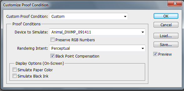

Proof Setup dialog box
Select the custom profile that you will be using to print with. For the profiles of our papers and printers, visit our ICC Profiles download page. These are constantly updated to ensure the most accurate profile available.
Once your profile is installed, simply select it from the profile drop down menu under Device to Simulate
There are a number of options in the dialog box. Never select “Preserve Color Numbers”. When it is selected, it will prevent the conversion of color spaces from occurring.
2. Choose a Rendering Intent
Rendering intents determine how the colors from the larger image color space will be remapped to the smaller color space of the printer. When printing photographic images, there are only two appropriate rendering intents that are appropriate: Relative Colorimetric and Perceptual.
The Perceptual rendering sacrifices color accuracy in order to preserve the similar relationship between colors. Relative Colorimetric rendering only changes the colors in the image that the printer cannot reproduce; those colors that are out of gamut. This can lead to unnatural looking transitions in color and tone when you have an image where there are lots of colors that your printer cannot reproduce.
American Frame uses the Relative Colorimetric rendering when printing photographic images on glossy papers such as Epson Premium Luster Photo Paper to preserve color accuracy. When printing to canvas and matte surface papers, the Perceptual intent is utilized. This is to ensure that detail in saturated colors outside of the printer’s color range won’t be lost. Recall that Perceptual sacrifices color accuracy for color relationships, so occasionally you may notice a very subtle color shift as a result of the colors being mapped to the smaller color range of the paper.
Here are some rules of thumb. Use “Relative Colorimetric” when printing to coated papers such as glossy, pearl, luster, and semi-gloss. This is because they have large color spaces so there is less chance of your image having colors that can’t be reproduced. When printing onto matte papers, use “Perceptual Colorimetric” as you are more likely going to experience problems with blocked up or out of gamut colors due to matte papers’ smaller color space. “Perceptual” is a better choice when printing a scene containing large areas of dark green. This is because those colors tend to be outside the color space of most printers which leads to large areas of muddy gray and green when the “Relative Colorimetric” rendering intent is utilized.
3. Select the Black Point Compensation option box
This remaps the darkest tone in your image to the darkest tone that your printer can reproduce.
4. Select the Preview box to begin viewing your soft proof and continue editing
When the Preview option box is selected, you will be viewing a soft proof of your image. Toggle it on and off to see how the soft proof defers from the image displayed using full range of color that your monitor can produce.
If you are printing to a glossy paper, and your image doesn’t contain many saturated colors, it is likely that you won’t see any difference at all. That’s great! It means the printer is capable of printing all the colors in your image.
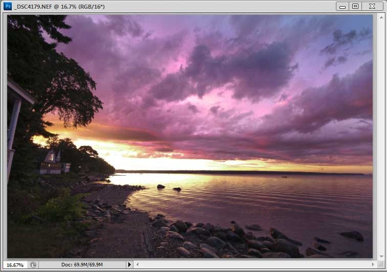

Image prior to soft proofing
The image in soft proof view using Relative Colorimetric Intent. If your image contains very saturated colors and you are printing to a matte or fine art paper, then your image will likely print flat compared to the image utilizing the full capabilities of your monitor.
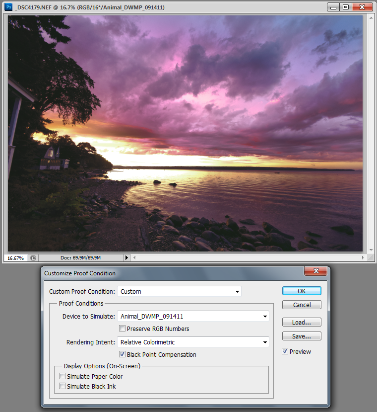

Proof with Relative Colorimetric Intent
The image in soft proof view using the Perceptual Intent. When printing very saturated images such as this onto matte and fine art papers, we generally suggest that the Perceptual Intent is utilized.
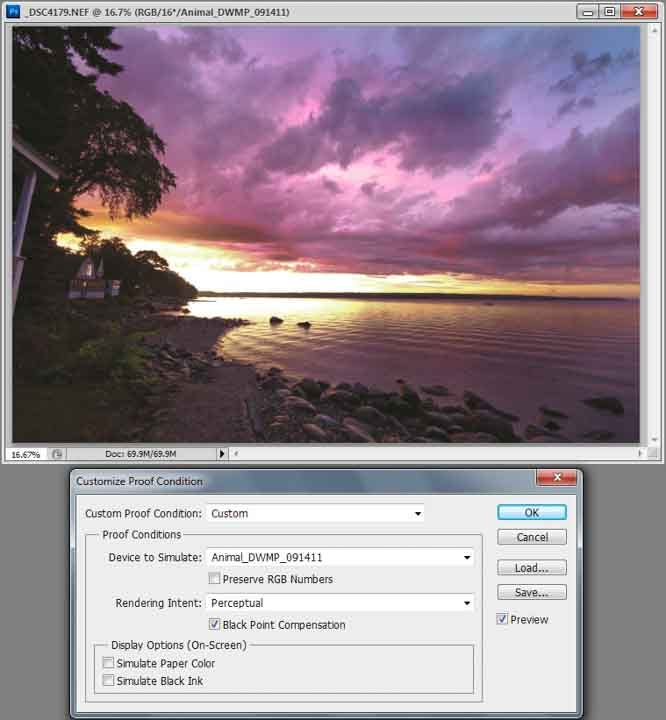

Proof with Perceptual Intent
Selecting the Simulate Paper Color option will automatically select the Simulate Black Ink option. The Simulate Paper Color option will restrict the tonal range of the monitor the limited range of tones that your paper can reproduce. You will likely be surprised at how flat this option makes your image appear. Some people find that using the Simulate Paper Color option is too hard to get used to. Especially when soft proofing matte papers which have a narrow tonal range compared to coated papers. Regardless of whether or not you use it, reviewing your image as a soft proof can be very valuable in pointing areas of you image that could be improved prior to printing. That really is the value of soft proofing after all; the ability to fix your image based on how it will look printed.
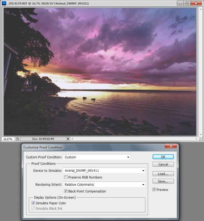

The image in soft proof view with the Simulate Paper Color and Simulate Black Ink selected
After you have decided upon a rendering intent, select the OK button to apply the soft proof settings. This will keep you in soft proof view which will allow you to edit your image further with an eye toward how it will print.
To quickly toggle the soft proof view on and off, simply hit: Ctrl + Y.
Note: When you are viewing the soft proof, the title bar of the image will reflect the color space conversion that is being simulated incorporating a backslash with the name of the profile after the file name.
The soft proof is the closest your monitor will ever look to your print. If you are not happy with how your image looks as a soft proof, then it is necessary to perform additional image editing. Often your soft proof will benefit from an increase in contrast using a Curves adjustment layer. It is also common to notice a color cast that you hadn’t noticed prior to soft proofing.
Of course, the accuracy of this ‘proof’ depends entirely on the accuracy of your monitor and printer profile. This is why American Frame routinely generates new printer profiles to account for any possible change in the printer performance over time. Remember that your monitor has to be calibrated for the soft proof to be effective. Also keep in mind, to perceive more accurate color the viewer should be positioned so that they are seeing the monitor straight ahead center. Be aware that the brightness/values will shift if viewed from an angle, either above/below center or left/right center, on most flat screen monitors. So make sure you have adjusted your chair or your monitor height to be centered at eye level, before you begin editing your photos.
Once you are happy with how your image looks viewed as a soft proof, simply turn off the soft proof and save your image with the original embedded profile. In other words, you do not have to convert your image to the profile that you used to soft proof. That will occur automatically in our workflow.
Lastly, keep in mind that your monitor will never exactly match the final print as they are fundamentally different. The monitor emits light while the print depends on reflected light. However, careful soft proofing will greatly increase the accuracy of your prints.
As a final check of your editing, when you print with American Frame use the option to order a proof set of your image. The color proof will show how the colors reproduce on your choice of paper. The resolution proof will show pixilation at the size you choose to print. Both are helpful in helping to guarantee the results you expect.

